Dagatha receives a letter from a woman called Maggie who is rather confused. Maggie recently heard some paradoxical information regarding COVID-19 mortality rates and can’t make head-nor-tail of it, so was wondering whether Dagatha would be able to play the role of (d)agony aunt. Here’s what’s confusing Maggie: early in the COVID-19 pandemic the ‘case fatality rate’ (a fancy term indicating the percentage of deaths from COVID-19 of people infected with the virus) in Italy vs China differed. It seemed as though the case fatality rate was lower among younger Italian citizens aged 18-60 (0.1% in Italy vs 0.2% in China) and lower among older Italians aged over 60 (6% in Italy vs 8% in China). So it would be sensible to therefore conclude that, over all ages, Italy had a lower COVID-19 case fatality rate than China. But when looking at all ages in Italy the case fatality rate was 4%, which was higher than the 3% overall rate in China. Maggie asks Dagatha if she has any idea what’s going on here - Surely if the case fatality rate is lower in both ages in Italy than the overall rate should be lower as well??
Dagatha ponders this apparent conundrum, which, despite this new guise, appears eerily familiar. Then it hits her: Simpson’s paradox - of course! Simpson’s paradox occurs when the stratified data (here, case fatality rates split by age group) give a different answer to the aggregated data (here, combined case fatality rates over all ages). With cases like this the answer is often due to some form of confounding, which once we realise and adjust for resolves the paradox. Dagatha suggests that one potential solution is due to demographic differences between Italy and China. China has a younger population (average age of 38), while Italy has an older population (average age of 47). To show Maggie how this could result in such counterintuitive results, Dagatha makes a table of some simulated data, where ‘inf’ means ‘the number of people infected with the COVID-19 virus’ and ‘died’ indicates the number of those who died of COVID-19.
| Country | Inf (<60) | Died (<60) | Inf (60+) | Died (60+) | Inf (All) | Died (All) |
|---|---|---|---|---|---|---|
| Italy | 10000 | 10 | 20000 | 1200 | 30000 | 1210 |
| China | 20000 | 40 | 10000 | 800 | 30000 | 840 |
While these numbers aren’t exactly those of Italy and China in real-life, they illustrate the general principle: if we look within age categories then Italy has a lower fatality rate in both younger (Italy = 0.1%; China = 0.2%) and older (Italy 6%; China = 8%) cohorts, but overall Italy has a higher fatality rate (Italy = 4%; China = 2.8%). Looking at the numbers within each age gives a clue as to what is going on here. As China has a younger population more younger people got infected, but as they’re younger they were less likely to die from COVID-19; while in Italy the population is older, meaning more older people got infected, and as older people are more likely to die from COVID this biases the aggregated comparisons between the countries. Dagatha re-assures Maggie that nothing paradoxical is going on here, and that the correct answer is that fatality rates are indeed lower in Italy, it’s just that the demographic differences between the two countries obscures this when using the aggregated data.
This example is based on a real-world example of Simpson’s paradox in COVID-19 fatality rates1, and links back to the previous post about the importance of understanding the causal structure of data when making inferences. Here, as demographic differences between countries confound the overall case fatality rates, we know that we need to stratify by age to get the correct answer. While knowledge about confounding is an important topic - and one we’ll explore in more detail in the next post - here I want to focus on the importance of simulating data and how this can help us understand these issues with greater clarity (just like Dagatha showed with the table above). So in this post we’ll take a quick diversion into simulating make-believe worlds which we’ll make good use of in later posts dealing specifically with causality.
How to simulate data: the basics
We’ll start by simulating basic distributions of single variables, and then build up more complexity to simulate realistic2 systems which hopefully mimic real-world patterns.
Let’s start with the familiar normal (or Gaussian/bell-shaped) distribution, which we can simulate like so (Stata code for all the commands will be given at the end of the post). Here we’re simulating 1,000 values taken from a normal distribution with a mean of 5 and a standard deviation (SD) of 1. We also set a seed number, which ensures that all results are reproducible and we all get the same random sample.
set.seed(182)
x <- rnorm(n = 1000, mean = 5, sd = 1)
summary(x)
## Min. 1st Qu. Median Mean 3rd Qu. Max.
## 2.109 4.307 4.971 4.986 5.710 7.826hist(x)
We can also simulate other distributions, like a binary/Bernoulli distribution (where outcomes are either ‘0’ or ‘1’). This is a special case of a binomial distribution with only one trial, like a single flip of a coin. Here ‘size’ is the number of ‘coin flips’, and ‘p’ is the probability of each ‘flip’ being a ‘success’ (say, heads) - Although really it could apply to any binary variable (like ‘male vs female’, ‘non-smoker vs smoker’, ‘no heart attack vs heart attack’, etc.). Here we’re simulating a 50/50 probability:
y <- rbinom(n = 1000, size = 1, p = 0.5)
table(y)
## y
## 0 1
## 469 531Or we could simulate a poisson distribution based on the number of ‘counts’ or ‘occurrences’ of an event happening. Say, the number of close friends people say they have. Poisson distributions only have one parameter which determines their shape known as ‘lambda’, and this sets the mean and the variance of the poisson distribution (poisson distributions have equal mean and variance). Here we’ll set a lambda value of 4:
z <- rpois(n = 1000, lambda = 4)
mean(z)
## [1] 4.024var(z)## [1] 4.281706hist(z)
Many other distributions are possible (log-normal, binomial, negative-binomial, uniform, etc.), but these are some of the more common ones and are more than enough to get started with.
A simple simulation study
With these tools in hand, we can run our first simulation study: finding patterns in random noise.
Let’s simulate two normally-distributed variables which are independent from one another and look at their correlation:
set.seed(41)
x <- rnorm(100, 0, 1)
y <- rnorm(100, 0, 1)
cor.test(x, y)
##
## Pearson's product-moment correlation
##
## data: x and y
## t = -0.59008, df = 98, p-value = 0.5565
## alternative hypothesis: true correlation is not equal to 0
## 95 percent confidence interval:
## -0.2529635 0.1385353
## sample estimates:
## cor
## -0.05950187Unsurprisingly, we find no association between x and y - which makes sense because we simulated the data to be like that!
However, if we repeat this numerous times we’re likely to see spurious associations just by chance. Taking a standard alpha/significance level of 0.05, we would expect this to occur approximately 1 in 20 times (5% of the time). So let’s test this:
# Set the seed
set.seed(42)

# Marker to monitor number of 'significant' associations
sig <- 0

# Repeat the simulation 1000 times
for (i in 1:1000) {
  x <- rnorm(100, 0, 1)
  y <- rnorm(100, 0, 1)

  # If p<0.05, add 1 to 'sig'
  if (cor.test(x, y)$p.value < 0.05) {
    sig <- sig + 1
  }
}

# Display the number of times p < 0.05
sig
## [1] 42Of these 1,000 simulations, we found a ‘significant’ association 42 times, which is pretty close to the expected 5% false positive rate. In a very simplified nutshell, this is part of the reason psychology and other disciplines are going through a ‘replication crisis’ where many published findings simply aren’t found to replicate; researchers may repeatedly conduct or analyse experiments in different ways until a ‘significant’ result is found and then publish that, even if in reality it’s all just random noise3.
Building up complexity and adding in causality
So far our simulated data has either been a single variable or two unrelated variables. It’s time to start bringing in some causality. In the previous post I introduced DAGs (directed acyclic graphs) and how to interpret them: an arrow between two nodes/variables indicates that one causes the other. In our example above x and y were independent, so we can represent that in a DAG with no arrow between the two variables, like so:

How the variables are causally related to create the data is known as the data generating mechanism (DGM). This may sound a bit complex, but really is just a fancy way of saying how the data were constructed. We can encode this DGM in a DAG. In real-world systems often the actual DGM will be somewhat unknown and will rest on certain assumptions (previous studies, expert subject knowledge, logic, etc.), but for simulated data we have complete control over the DGM so can create whichever worlds we want.
So let’s take a slightly more complicated DAG where x does cause y and simulate this, again assuming that x and y are normally-distributed variables. Start by simulating x (with a mean of 0 and SD of 1), then create y based on values of x (where a one-unit increase in x causes, on average, a one-unit increase in y; we add some noise to the y variable so that the relationship is not perfect/completely deterministic, meaning that in some cases the association will be less than one, while other times it will be more than one).

set.seed(2112)
x <- rnorm(n = 100, mean = 0, sd = 1)
y <- x + rnorm(n = 100, mean = 0, sd = 1)
Let’s plot this data, to make sure it worked as we expected.
plot(y ~ x, main = "Plot of x on y")
This all looks good, so let’s check the regression output as a double-check.
summary(lm(y ~ x))##
## Call:
## lm(formula = y ~ x)
##
## Residuals:
## Min 1Q Median 3Q Max
## -2.27097 -0.61016 0.00966 0.68246 2.35884
##
## Coefficients:
## Estimate Std. Error t value Pr(>|t|)
## (Intercept) -0.05802 0.10118 -0.573 0.568
## x 0.92436 0.09852 9.383 2.65e-15 ***
## ---
## Signif. codes: 0 '***' 0.001 '**' 0.01 '*' 0.05 '.' 0.1 ' ' 1
##
## Residual standard error: 1.012 on 98 degrees of freedom
## Multiple R-squared: 0.4732, Adjusted R-squared: 0.4678
## F-statistic: 88.03 on 1 and 98 DF, p-value: 2.648e-15cbind(coef = coef(summary(lm(y ~ x)))[, 1], confint(lm(y ~ x)))## coef 2.5 % 97.5 %
## (Intercept) -0.05802294 -0.2588159 0.142770
## x 0.92435976 0.7288546 1.119865The results match what we simulated, with an approximately one-unit increase in x associated with a one-unit increase in y (it’s not exactly 1 due to random error and only having a sample of 100 observations, but it’s close enough and the 95% confidence intervals contain this value, so we can be happy with that).
Ratcheting up the complexity
With these basics in place we can start building more complex datasets. Take the DAG below, which describes the causal relationships between exercise and having had a heart attack in the past year, and includes the covariates age and sex.
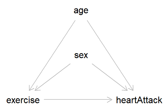
In this DAG, nothing causes ‘age’ or ‘sex’, so we can simulate these variables independently. For age, we will use a normal distribution with a mean of 50 and an SD of 10. As sex is a binary variable we will use a Bernoulli distribution with equal split for males and females (I have coded the variable as ‘male’, as we will say that males take the value 1).
set.seed(54321)
age <- rnorm(n = 10000, mean = 50, sd = 10)
summary(age)
## Min. 1st Qu. Median Mean 3rd Qu. Max.
## 11.37 43.07 49.95 49.88 56.75 86.91male <- rbinom(n = 10000, size = 1, p = 0.5)
table(male)## male
## 0 1
## 4977 5023Next we want to simulate ‘exercise’. As this is caused by both age and sex we need to factor in these relationships when constructing this variable. Let’s say that exercise is a normally-distributed variable indicating ‘number of hours of exercise per week’, and that both older people and men do less exercise. When simulating variables caused by other variables I normally construct a regression equation, which for exercise would look something like:4
\(exercise = \alpha + \beta_1 * age + \beta_2 * male + \epsilon\)
where:
- \(\alpha\) is the Intercept, which is the mean value of exercise when both age and male are 0
- \(\beta_1\) is the regression coefficient on exercise for a one-unit increase in age
- \(\beta_2\) is the regression coefficient on exercise for the difference between women (where male = 0) and men (where male = 1)
- \(\epsilon\) is the error term, which we need to include to add variability to the exercise values.
Taking the regression coefficients first, say that each additional year of age causes a reduction in exercise by 2 minutes per week (0.033 hours), and that men do 30 minutes less exercise per week than women. Then \(\beta_1\) = -0.033 and \(\beta_2\) = -0.5. The error term will have a mean of 0, while the SD of this term determines the variability in the exercise data; let’s take 1 hour as a reasonable starting value for this SD. And finally there’s the intercept term, which can be a bit fiddly and take some trial and error to find a reasonable value for; for now, we’ll say that when age is 0 and male is 0 (i.e., women) the mean exercise value is 10 hours (which is about an hour and a half of exercise per day)5. Let’s test these starting values out and see if they’re reasonable.
exercise <- 10 + (-0.033 * age) + (-0.5 * male) +
  rnorm(n = 10000, mean = 0, sd = 1)
summary(exercise)
## Min. 1st Qu. Median Mean 3rd Qu. Max.
## 4.242 7.377 8.097 8.106 8.833 12.807hist(exercise)
Hmmm…Okay, well these starting values seem a bit off, as the minimum value is over 4 hours of exercise per week. So we’ll lower the intercept term from ‘10’ to ‘7’ and widen the SD of the error term from ‘1’ to ‘1.15’.
exercise <- 7 + (-0.033 * age) + (-0.5 * male) +
  rnorm(n = 10000, mean = 0, sd = 1.15)
summary(exercise)
## Min. 1st Qu. Median Mean 3rd Qu. Max.
## 0.02061 4.25942 5.10425 5.10673 5.94362 9.82834hist(exercise)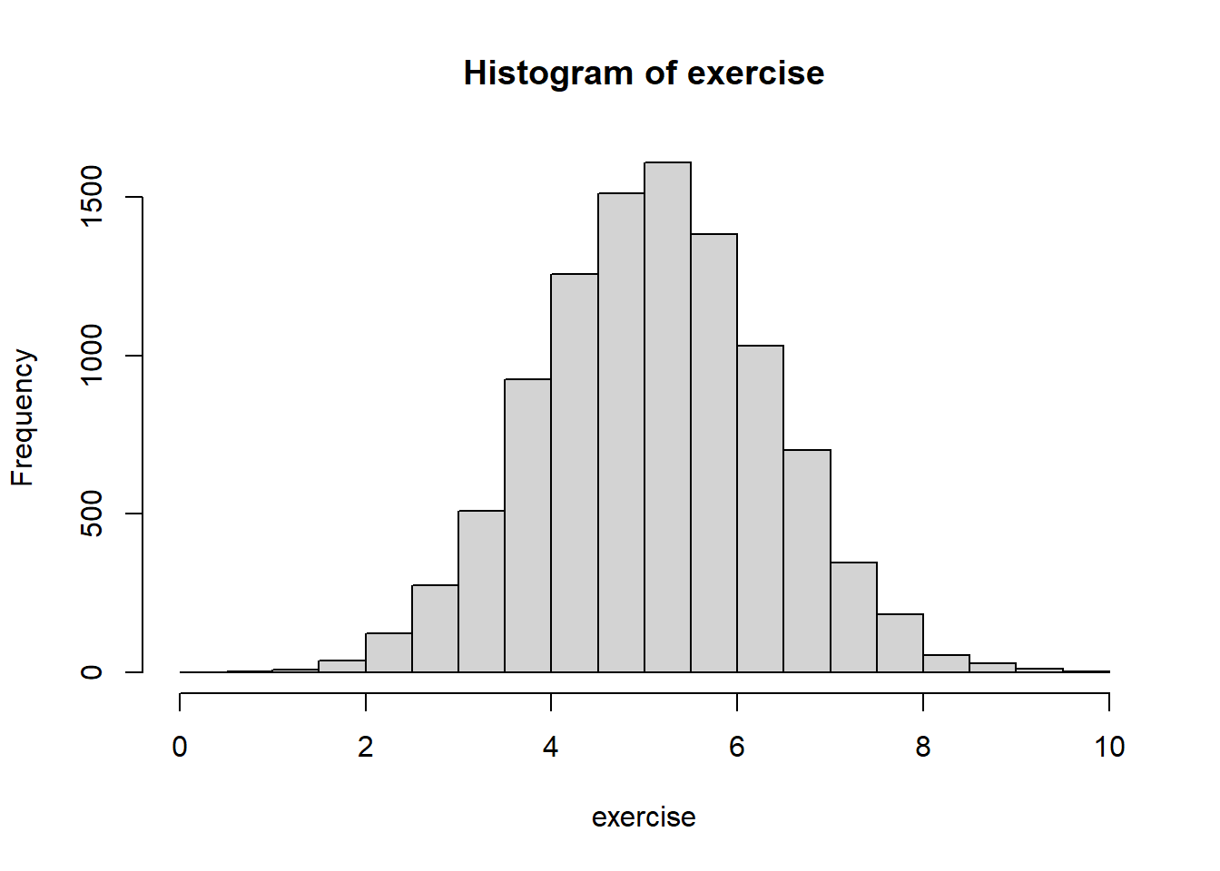
Okay, that looks a little more realistic, as now the lowest value is just a few minutes of exercise per week. These data of course aren’t perfect (and in real-life exercise would not be normally-distributed), but for this example this will do fine.6
One way of checking the simulated data are sensible is to run a regression model and make sure the parameters broadly match those simulated. If we do that here, we can see that the intercept, age coefficient, male coefficient and residual error are pretty much as we simulated, so everything seems to have worked fine!
summary(lm(exercise ~ age + male))##
## Call:
## lm(formula = exercise ~ age + male)
##
## Residuals:
## Min 1Q Median 3Q Max
## -4.5126 -0.7873 -0.0007 0.7769 4.2675
##
## Coefficients:
## Estimate Std. Error t value Pr(>|t|)
## (Intercept) 7.077234 0.060319 117.33 <2e-16 ***
## age -0.034576 0.001164 -29.70 <2e-16 ***
## male -0.489288 0.023362 -20.94 <2e-16 ***
## ---
## Signif. codes: 0 '***' 0.001 '**' 0.01 '*' 0.05 '.' 0.1 ' ' 1
##
## Residual standard error: 1.168 on 9997 degrees of freedom
## Multiple R-squared: 0.1173, Adjusted R-squared: 0.1171
## F-statistic: 664.3 on 2 and 9997 DF, p-value: < 2.2e-16The next step is to simulate the outcome (heart attack), which is a binary variable. This is a bit more complicated to simulate, but the approach is broadly the same as above for normally-distributed variables: write a regression equation, check the results are sensible, tweak the parameters if needed, and then validate using a regression model.
One complication with binary variables is that we first need to construct probabilities of being a ‘case’ (i.e., having a heart attack), and then simulate binary outcomes from that probability distribution. This requires working on the logit scale and takes a few more steps7.
First, we create the probability on the logit scale, using a similar regression equation to above. One difference is that we exclude the error term (as random variability will be added in later when we sample from the probability distribution). The other difference is that this model is specified on the log scale, as this is how logit models (and many other generalised linear models) work; as odds ratios are often easier to work with in terms of effect sizes, I tend to specify these on this scale, rather than working directly with log values. An example will hopefully make this more clear.
heart_logit <- log(0.05) + (log(1.05) * age) +
  (log(2) * male) + (log(0.8) * exercise)
summary(heart_logit)
## Min. 1st Qu. Median Mean 3rd Qu. Max.
## -4.1404 -1.8740 -1.3444 -1.3533 -0.8311 1.0393The first term is again the intercept, and says that, when values of age and male are 0, the odds of having a heart attack are 0.05 (meaning that heart attacks are pretty rare)8. For age, this model says that a one-unit increase in age causes an increase in the odds of having had a heart attack by 5%. For sex, males have twice the odds of having had a heart attack, relative to women. While for exercise, every one-unit increase in exercise causes a 20% reduction in the odds of having had a heart attack. These are our starting values, and we can update them later on if they don’t seem realistic.
Next, we need to convert this logit scale to the probability scale, which is a value between 0 and 1 regarding the probability of having a heart attack9.
heart_p <- exp(heart_logit) / (1 + exp(heart_logit))
summary(heart_p)
## Min. 1st Qu. Median Mean 3rd Qu. Max.
## 0.01567 0.13308 0.20679 0.22897 0.30341 0.73872Based on the above parameters, the minimum probability someone has for having a heart attack is 2%, the maximum is 74%, while the mean value is 23%. This seems quite high, so let’s edit the parameters to lower the risk. We’ll lower the intercept odds from 0.05 to 0.01, and weaken the effect of age from 1.05 to 1.025.
heart_logit <- log(0.01) + (log(1.025) * age) +
  (log(2) * male) + (log(0.8) * exercise)
heart_p <- exp(heart_logit) / (1 + exp(heart_logit))
summary(heart_p)
## Min. 1st Qu. Median Mean 3rd Qu. Max.
## 0.00213 0.01005 0.01529 0.01788 0.02342 0.07993This looks a bit better, as the minimum risk is now 0.2%, the mean is 2% and the maximum is 8%. These probabilities may not match reality exactly, but they’ll do for our purposes here.
Our next step is to convert these probabilities to a binary 0/1 variable by simulating from the probability distribution. This is just our old friend ‘rbinom’, with a fixed probability replaced by the probabilities for each person we modeled above.
heartAttack <- rbinom(n = 10000, size = 1, prob = heart_p)
table(heartAttack)
## heartAttack
## 0 1
## 9802 198Of 10,000 simulated observations, 198 were predicted to have a heart attack. Now, let’s check these parameters match the regression model (remember, as logistic models work on the log-odds scale, we need to exponentiate these coefficients to get them on the odds ratio scale).
heart_mod <- glm(heartAttack ~ age + male + exercise,
                 family = "binomial")

# Summary of model on the log-odds scale
summary(heart_mod)
##
## Call:
## glm(formula = heartAttack ~ age + male + exercise, family = "binomial")
##
## Deviance Residuals:
## Min 1Q Median 3Q Max
## -0.4471 -0.2302 -0.1797 -0.1409 3.2992
##
## Coefficients:
## Estimate Std. Error z value Pr(>|z|)
## (Intercept) -4.190065 0.579711 -7.228 4.91e-13 ***
## age 0.020425 0.007538 2.710 0.00674 **
## male 0.811413 0.161910 5.012 5.40e-07 ***
## exercise -0.259639 0.062467 -4.156 3.23e-05 ***
## ---
## Signif. codes: 0 '***' 0.001 '**' 0.01 '*' 0.05 '.' 0.1 ' ' 1
##
## (Dispersion parameter for binomial family taken to be 1)
##
## Null deviance: 1945.2 on 9999 degrees of freedom
## Residual deviance: 1872.8 on 9996 degrees of freedom
## AIC: 1880.8
##
## Number of Fisher Scoring iterations: 7# Summary on the odds ratio scale
exp(cbind(OR = coef(summary(heart_mod))[, 1],
confint(heart_mod)))## OR 2.5 % 97.5 %
## (Intercept) 0.0151453 0.004808497 0.04667434
## age 1.0206350 1.005691708 1.03585848
## male 2.2510857 1.648777916 3.11417963
## exercise 0.7713297 0.682332891 0.87167802These parameters are broadly what we expected, so we can be happy that our simulation worked as planned!
Summary: benefits of simulating data
That’s probably enough simulations for now, so I’ll stop here. In the next post on confounding we’ll make good use of simulated data to explore exactly what confounding is and how it can bias associations. But hopefully this post has been a relatively gentle introduction to simulating data. It may seem like a lot of effort to create some fake data, but I believe there are quite a few benefits to using simulated data:
- It’s a way of testing the assumptions of our data and can help to understand core causal concepts like confounding, mediation and colliders without having to worry about potentially complex mathematical formulae, proofs or equations. They can therefore be a really useful pedagogical tool, especially if - like me! - you’re not the most mathematically-inclined person.
- You can simulate data before starting data collection. This can be useful to test planned analyses, conduct power analyses, and ensure that, given your assumed DAG, it is possible to estimate the effect you’re interested in10.
- Conduct formal simulation studies, comparing different statistical methods, for example, or using simulations to conduct sensitivity analyses and explore how making different assumptions (about confounding, selection, etc.) impact your conclusions.
- By creating worlds, you feel like a God!
Further reading
Chapter 6 of Judea Pearl and Dana Mackenzie’s Book of Why is a nice introduction to paradoxes/riddles, like Simpson’s paradox, and how a causal approach can help untangle and understand them.
In addition to being great textbooks on statistics more generally, both ‘Statistical Rethinking’ by Richard McElreath and ‘Regression and other stories’ by Andrew Gelman, Jennifer Hill and Aki Vehtari have a strong focus on using simulating data to understand statistical concepts.
If anyone is interested in the process of conducting formal simulation studies, this paper by Tim Morris and colleagues is a great introduction.
Stata code
** Make sure Stata memory is clear and create a new
** dataset with 1000 observations
clear
set obs 1000
set seed 182

** Generate normal distribution, with mean of 5 and SD of 1
gen x = rnormal(5, 1)
sum x
hist x, freq

** Binary/Bernoulli variable with 50% chance of
** each outcome
gen y = rbinomial(1, 0.5)
tab y

** Poisson count distribution with a mean/variance
** of 4
gen z = rpoisson(4)
sum z, d
hist z, freq width(1)


*** Simulating correlations between independent
** normally-distributed variables
clear
set obs 100
set seed 41
gen x = rnormal()
gen y = rnormal()
pwcorr x y, sig


** Embed this in a loop to count number of
** spurious associations
* Set the seed
set seed 42

* Macro to count 'significant' associations
local sig = 0

* Repeat the simulation 1000 times
forvalues i = 1(1)1000 {
  clear
  set obs 100

  gen x = rnormal()
  gen y = rnormal()

  * If p<0.05, add 1 to 'sig'
  quietly pwcorr x y, sig
  matrix res = r(sig)
  local p = res[1,2]
  if `p' < 0.05 {
    local sig = `sig' + 1
  }
}

* Display the number of times p < 0.05
display `sig'


*** Example where x causes y
clear
set obs 100
set seed 2112

gen x = rnormal()
gen y = x + rnormal()

twoway scatter y x

regress y x


*** Exercise and heart attack example, with
*** age and sex as confounders
clear
set obs 10000
set seed 54321

* Simulate the age variable (caused by nothing)
gen age = rnormal(50, 10)
sum age

* Simulate the sex variable (also caused by
* nothing; male = 1)
gen male = rbinomial(1, 0.5)
tab male

* Initial setting for exercise variable (caused
* by age and sex)
gen exercise = 10 + (-0.033 * age) + ///
    (-0.5 * male) + rnormal(0, 1)
sum exercise
hist exercise, freq

* Tweaking the exercise model to make more
* realistic
drop exercise
gen exercise = 7 + (-0.033 * age) + ///
    (-0.5 * male) + rnormal(0, 1.15)
sum exercise
hist exercise, freq

* Check the coefficients match those simulated
regress exercise age male

* Next, simulate the binary 'heart attack'
* outcome (here, will use the 'invlogit' command
* to create the logit values and convert these
* to probabilities in one step)
gen heart_p = invlogit(log(0.05) + (log(1.05) * age) ///
    + (log(2) * male) + (log(0.8) * exercise))
sum heart_p

* And again, tweaking some of the parameters
drop heart_p
gen heart_p = invlogit(log(0.01) + (log(1.025) * age) ///
    + (log(2) * male) + (log(0.8) * exercise))
sum heart_p

* Create a binary variable from this probability
* distribution
gen heartAttack = rbinomial(1, heart_p)
tab heartAttack

* And check that the parameters match the
* odds ratios simulated
logit heartAttack age male exercise, or
Although the numbers in the table are made-up.↩︎
ish↩︎
It’s also possible that researchers may just get unlucky and be the one-in-twenty chance of finding an association in the random noise on the first attempt without any statistical massaging/p-hacking. For an entertaining account of the replication crisis, see Stuart Ritchie’s book ‘Science fictions: Exposing fraud, bias, hype and negligance in science’.↩︎
You can also simulate data via other methods, such as using a multivariate normal distribution, but I quite like using the regression-based approach as you have full control over all the parameters, can easily check the simulations worked correctly, and can apply to other distributions beyond the normal. This is just personal preference though.↩︎
Obviously it makes no sense to say that a newborn baby exercises for 10 hours per week, but we don’t need to take these intercept values seriously; we just need intercept values which make the observed data vaguely sensible.↩︎
One - often rather sensible - option is to simulate data based on known distributions from existing research, but we wont pursue that option here.↩︎
I wont describe logit distributions or logit/logistic regression here. Most statistics/regression textbooks should cover these, such as ‘Statistical Rethinking’ by Richard McElreath or ‘Regression and other stories’ by Andrew Gelman, Jennifer Hill and Aki Vehtari. See also this stats.idre page for an introduction to fitting and interpreting logit models in R.↩︎
When the outcome is rare, odds are very similar to probabilities, so here we can say that the probability of having had a heart attack at the intercept values is approximately 5%. However, when outcomes are more common the interpretation of odds and probabilities diverge quite considerably: see here↩︎
It is possible to calculate probabilities from a logit model in one step using an inverse logit function (command
plogisin R), but I’m showing the two-step process here to make it clear how these probabilities are calculated.↩︎known as an ‘estimand’ - see this paper for a discussion of the importance of defining estimands↩︎